This is my Poem Visualization thought-process paper and a jpg of the flames stitched together, without the words - I'm sorry I wasn't able to take a photo of the book in the hall before the janitor swept up the orange peel and honestly it disheartened me so much that it happened that I forgot to take one of the pages left. EDIT: So apparently the picture thing isn't an issue because blogger is refusing to let me upload images. So. You have my documentation. And the memories. Yes.
Nicole Makino
Poem Visualization Documentation
For my poem visualization I chose “Oranges” by Gary Soto. This is a somewhat dated poem about a universal story: the start of young love. It’s about a boy going on a date, armed with only a nickel and two oranges, in the cold dark of December. The date is going well, and he holds his orange in his hand, describing it as “…so bright against/The gray of December/That, from some distance,/Someone might have thought/I was making a fire in my hands.” The fire, obviously, represents the glow of their love and relationship as it sparks into existence, beginning as a miniscule ember and growing into a bright and roaring flame. That’s the feeling that I tried to bring across with this project: a small fire that slowly gets more expansive and more bright and consuming. I used photoshop to illustrate a representation of flames getting larger and brighter and taking up more and more of the black background until it completely shuts the blackness out. I used several layers with various blending mode effects to make them pop, like linear burn and hard light mix. I really wanted to give a feeling of jumping off the page, or an almost unrealistic brightness to the color. I really wanted to bring across the life of fire. This ended up not translating very well to print: I thought I had a pretty good color arrangement on the computer and I was planning on printing on Holman’s phaser. Unfortunately, purpose doesn’t always translate into practice. Holman for some reason refused to print, sending me on a mad quest through all the people I know, asking for access to printers (my own having run out of black ink weeks ago). I looked for black ink in the bookstore, too, but they didn’t have any cartridges compatible with my printer! When I finally was able to get all of the pages, after going through several different friends and buying ink for someone else’s printer, I was so relieved just to have the pages that I wasn’t about to nit-pick the dullness of the color. I broke up the poem according to what I felt worked as natural breaks in the story, and set them to the flames in an opposite gradient to the fire. The lines in the first, darkest page were taken from the colors of the bright yellow at the end of the piece, while the lines on the last page were taken from some of the darker colored “flames” on page one. All of the text in the middle pages were colors taken from the corresponding “opposite” pages in the same way, working in an order from bright yellow to deep red. The ones in the middle, as shades of orange, were getting lost more easily than on the ends as the got closer to that tricky mid-point where the values of text and flame were meeting up, so I added a second layer of text, slightly off center, like a backdrop shadow, to all of the middle pages, in a different color (often that of the text line that comes after it) and lowered the opacity to make them transparent, again going with the shadow/glow effect to not lose the living, moving fire element. The typeface I chose was BIRTH OF A HERO – a sort of charred, sparking-ember looking geometric sans serif that I felt really brought across the feel of the old time setting, yet also portrayed the effect of the fire as the dominant element: stronger than the words. I will pin the pages to a wall in Holman through slices of an orange, letting the juice dribble down the pages. Going with the themes of growing larger and more plentiful, I will order the pieces with the smallest ones at the first pages leading up the bulkiest for the last pages. I’ve also printed out a page with the author’s name and the title of the poem – this one is much smaller, with the text color again taken from the darkest red of the fire on page one, and will be on the side, slightly curled at the edges, like an old page (this is also represented by the only faintly yellowed background color) and bringing across the same kind of feel as Zurbaran’s Saint Serapion did when he painted an old crinkled piece of paper with the painting’s information on it into his piece. It will also be pinned through an orange. I am going with the simple method of pinning the pages to a plain white wall with nondescript clear tacks (I wanted dull nails, but the bookstore doesn’t sell them) because I really want to emphasize the vibrancy of the fire. My only fears are that the way that my colors ended up printing, it will only come across as dull, and that the flimsy paper I had to use will curl or fall around when I really need them to lie flat against the wall. The peel of the orange will be scattered below the pages, with the vibrancy of the orange peel lending aid to the imagination of the bright orange “flame” from the poem. I will put the larger chunks of peel underneath the final page and the smaller ones underneath the first page, again matching the themes of growing in volume, both physically and metaphorically emotion-wise. The pages will all be right next to each other so as not to break up the flow of the fire.
Gary Soto - "Oranges"
The first time I walked
With a girl, I was twelve,
Cold, and weighted down
With two oranges in my jacket.
December. Frost cracking
Beneath my steps, my breath
Before me, then gone,
As I walked toward
Her house, the one whose
Porch light burned yellow
Night and day, in any weather.
A dog barked at me, until
She came out pulling
At her gloves, face bright
With rouge. I smiled,
Touched her shoulder, and led
Her down the street, across
A used car lot and a line
Of newly planted trees,
Until we were breathing
Before a drugstore. We
Entered, the tiny bell
Bringing a saleslady
Down a narrow aisle of goods.
I turned to the candies
Tiered like bleachers,
And asked what she wanted -
Light in her eyes, a smile
Starting at the corners
Of her mouth. I fingered
A nickle in my pocket,
And when she lifted a chocolate
That cost a dime,
I didn't say anything.
I took the nickle from
My pocket, then an orange,
And set them quietly on
The counter. When I looked up,
The lady's eyes met mine,
And held them, knowing
Very well what it was all
About.
Outside,
A few cars hissing past,
Fog hanging like old
Coats between the trees.
I took my girl's hand
In mine for two blocks,
Then released it to let
Her unwrap the chocolate.
I peeled my orange
That was so bright against
The gray of December
That, from some distance,
Someone might have thought
I was making a fire in my hands
Read more!
Tuesday, December 15, 2009
Collaborative Presentations Day 2
Usman Haque and Rebecca Allen; Cory Arcangel and Lillian Schwartz; John Lasseter and John Knoll; Pascal Dombis and Terry Mulligan
Liz and Jessica did an exhibit on Usman Haque and Rebecca Allen, titled Interaction Required. It was about interactive technologies and the viewer playing a central role in the gallery space. Usman would be presented outside and Rebecca inside.
Rebecca's pieces were "Fleeting Words" (1991), "Bush Soul #2" (1998), and "Sleight of Hand" (2004). Bush Soul #2 dealt with human prescence in the artificial world. It invovled a vibrating joystick and was meant to show the reaction of humans in an enviornment. They claim that it's "not like a game", but it sure seems like one to me. Slight of Hand also screams of gaming potential. It is an excellent use of virtual reality technology, sensitive to human hand movement.
Usman took viewer creation in a different direction. His "Blurbal" was a light show inside balloons, with the entire contraption strung together and attached to handlebars that the audience could turn to manipulate the lights and shape. He had "Primal Source" at a beach festival in California, 2008, which utilized mist projection and light, and the crowd determined the imagery. The one that impressed me the most was "Evoke", which used microphones in the crowds to control colors lighting up a building. It was able to determine the difference between not only volume levels but between the lilts and tempos of applause, singing, clapping, yelling, etc. The throng crowding the building certainly shows that it succeeds in impacting the people.
---
Ryan and Kyle Czepiel did Cory Arcangel and Lillian Schwartz, in an exhibit to be viewed at the MET.
Cory manipulates technology to create art. His pieces include "Super Mario Clouds", which shows the beauty of clouds through game technology by breaking into the Mario game cartridge and removing everything except for the clouds from the game, "I Shot Andy Warhol", which removed targets in an old shooting game with famous people, "Super Mario Movie", which created a movie from the Super Mario game wherein the game breaks down to the tune of his own soundtrack, and "Sans Simon", the only non-video game piece, in which Cory uses his own shadow to block the image of Paul Simon throughout and entire video of a song at a concert.
Lillian has the "Mona Leo", which splices Leonardo daVinci's chalk portrait together with his Mona Lisa - it is an argument regarding the speculation that Mona Lisa is actually his self-portrait. She also has "Pixelation", which is meant to establish a new medium - the computer for art as a new paintbrush tool, and another work too which deals with the idea that computer animation is a form of art, with special effects and form.
Cory questions what we view art as and Lily expands the viewers' perception on what we know.
---
Next there was an exhibit of John Lasseter and John Knoll, on the development of a digital art.
Lasseter was a Disney animator who moved to Pixar. He did the short film "Where the Wild Things Live" which mixed 2-D and 3-D animation. He also did all-computer graphics animation projects of Andre and Wally B., as well as the Pixar icon of the lamp jumping on the ball. He also was the chief contributor to Toy Story: the first feature-length computer animated film.
Knoll, on the other hand, created the first version of photoshop, which was a mac-compatible floppy. He did "Abyss", which, in contrast to Lasseter's computer animation films, was the first movie with cg animation. He was also behind Star Trek, and the cg model of the light ship in season 3.
Both Lasseter and Knoll work on a lot of movies as the first of their kind in their respective fields of special animation.
---
Jessica Crocco and Liz Hannah did Pascal Dombis and Terry Mulligan in an exhibit titled "Repetition".
Dombis worked with algorithms. "Rizong III" is a digital print with hundreds of intersecting lines, which suggests both chaos and order. "Topo Rizong" (2004) is a geneation of many ovals into a large work of art, and "Antisana" is a specific digital print installation with a similar building up of a repeated pattern that zooms out into a new image. It's the same shapes repeating over and over again until it creates an organic form that is its own peice.
Mulligan also uses excessive patterns, but already has the image to create in mind, which makes it more - or is it less? - flexible. Some works include "Five Objects", which is squares and different shapes repeated with an emphasis on color to form images like sailboats and pears. Also there is "Music Series", a symmetrical-ish composition of guitars and notes, again with square repetition. Finally we have "Abstract and Color", which is still utilizing a pattern but is obviously very formulated and thought out.
Read more!
Tuesday, November 24, 2009
Collaborative Presentations: Day One
Toni Dove and Christopher Jordon; Pascal Dombis and Jeffrey Shaw.
Toni Dove and Christopher Jordon:
They said that the interactive video artist Toni Dove and the photographer Chris Jordon are both artists making a statement about consumerism. I definitely was able to see the connection in Chris Jordon's work. Both his Intolerable Beauty and his work with the trash found in bird corpses really force our eyes open to what we as wasteful humans are doing to our environment. The arrangement of trash in the birds' bodies make one wonder if such an arrangement is even possible and the painting replica made up of 106000 cans - and that being 30 seconds worth of cans - is a shocking thing to hear. I think that the explanation along with the Colbert Report video really enhanced the work and helped to drive the point home. Toni Dove, on the other hand, I wasn't really getting "consumerism" from her. Sure, her Artificial Changelings piece was really cool and a look at how our generation is so different from previous ones, as well as probably what we will do to ourselves if we continue on this path (that's what I'm assuming the land of fire was supposed to represent), so I can kind of see the connection there, but Spectropia, other than show her style of artwork, I thought wasn't so much any statement on consumerism as it was a showcase of awesome video game potential.
Art Through Systems, Pascal Dombis and Jeffrey Shaw:
The commentary on search engines and how we have connected ourselves so thoroughly to such an unreliable source as the internet is pretty radical. I felt like the Jeffrey Shaw section didn't make much sense though. They said that it was about "how people are connected to the net and control what they look at", but I don't really understand how, and I kind of got the feeling that they didn't either. Pascal Dombis, on the other hand, was a well developed section. His search-engine-produced results really speaks for itself, to the point where I wish he hadn't included the overlay of colors. I felt that was kind of unnecessary. Also I have no idea what the whole "straight line curving into a circle reforming into a straight line again" thing had to do with the theme. This exhibit started me thinking on how it would be cool to make a sort of interactive statement on search engine's unreliable results, maybe by having someone type in anything they want and the computer would then bring up many results on google image search or some such thing - both the relevant and the extremely NON relevant. I'm not sure how that would work though: it sounds too complicated even for programmers.
Read more!
Tuesday, November 17, 2009
Word Visualization
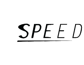
Here is my word visualization. I chose "speed" and tried to make it look like it was taking off quickly by kerning the letters more as I got later in the word as well as making them thinner. Elements at the very beginning were stretched too, to give the feel of an afterimage: that the word was going so fast the rest hadn't had time to catch up yet.
Read more!

Read more!
Monday, November 16, 2009
Poems
There is still some confusion about my poem because of that whole not knowing it had to be a published author thing. I have been trying to think of another poem since then. I had one recommended to me that is a cool poem, but I don't have nearly as developed an idea for it as I did for the other one. I will post them both here I guess.
Here was my first idea (The one with the children's book):
Stephanie Cuono - "Song Number Three"
we lie to little girls from an early age
we try to tell them that everything'll be ok
that if they wish upon a star their dreams will all come true
well, twinkle twinkle little star
how i wonder where the hell you are
cause i'm looking to the night sky
and i can't find you
and i wish that life was like a fairy tale
where everybody gets what they deserve
where the good guy always wins and the bad one always dies
(or has their eyes gouged out by little birdies beaks and claws)
and i wish that life was like a fairy tale
where even if things don't go according to plan
and everyone fails and you lose your man
you can still make everything right with a justified suicide
star light, star bright
first star i see tonight
i wish i may and i wish i might
that everything will turn out all right
Here is the other one I am considering. I am thinking about maybe incorporating a real orange with nails piercing the slices somehow? I'm not sure. It's a very underdeveloped idea right now.
Gary Soto - "Oranges"
The first time I walked
With a girl, I was twelve,
Cold, and weighted down
With two oranges in my jacket.
December. Frost cracking
Beneath my steps, my breath
Before me, then gone,
As I walked toward
Her house, the one whose
Porch light burned yellow
Night and day, in any weather.
A dog barked at me, until
She came out pulling
At her gloves, face bright
With rouge. I smiled,
Touched her shoulder, and led
Her down the street, across
A used car lot and a line
Of newly planted trees,
Until we were breathing
Before a drugstore. We
Entered, the tiny bell
Bringing a saleslady
Down a narrow aisle of goods.
I turned to the candies
Tiered like bleachers,
And asked what she wanted -
Light in her eyes, a smile
Starting at the corners
Of her mouth. I fingered
A nickle in my pocket,
And when she lifted a chocolate
That cost a dime,
I didn't say anything.
I took the nickle from
My pocket, then an orange,
And set them quietly on
The counter. When I looked up,
The lady's eyes met mine,
And held them, knowing
Very well what it was all
About.
Outside,
A few cars hissing past,
Fog hanging like old
Coats between the trees.
I took my girl's hand
In mine for two blocks,
Then released it to let
Her unwrap the chocolate.
I peeled my orange
That was so bright against
The gray of December
That, from some distance,
Someone might have thought
I was making a fire in my hands.
Read more!
Tuesday, October 27, 2009
Self Visualization Project - idea notes
Behind the cut is my current ideas for the self-visualization project.
For the self-portrait image I am thinking of showing three parts of who I am. One is going to be a play on the kanji that I made up to match my name about a month and a half ago: Try Again, Small Stream. I can tie this in with my actual name's meaning: something along the lines of grassy land or rice field, I think. I am going to focus on the theme of hope, and improving myself. Suzumietate WAY TO GO (even if you stumble, way to go)...or something along those lines, because I feel that that reflects my personality well. I will have myself sitting in an almost silhouette like way with light shining down from above: not in any weird heaven or angsty death way, but as the light of hope (or some other corny thing along those lines) that I look towards. My brother, probably the biggest influence in my life, is going to be looming larger than life, perhaps in a classic maou pose to show how much power he has over me - he is sort of the source of my light...? He will be side-lit, to show that he can affect me in both a positive and a negative way, but no matter what it has a great influence on me. I may or may not include inspirational thingies I've gotten from friends etc. in the past, I'm not sure. It depends on how it works with the composition.
Read more!
Monday, October 19, 2009
Illustrator Ex 2
Here's my illustrator-ed photoshop image. Illustrator is a lot harder than photoshop, somehow - I guess cause I don't have as much experience. I find manipulating layers etc. so much more difficult in it though! Anyway I'm not sure if I did very well because I'm new to the program but I tried my best! I'm not sure how to make it stop being sideways. ._.;;;;

Read more!

Read more!
Subscribe to:
Posts (Atom)